A project from Red Hat.
redhat.com — homepage, navigation, and research
When I joined Red Hat in 2021, I landed on the system UX team working on redhat.com—homepage strategy, global navigation, and page templates that had to hold up across a huge product catalog. I worked closely with content strategists; engineers were embedded on the team. Most of this work shipped in roughly quarterly cycles in Figma, on Drupal.
Simplifying the homepage
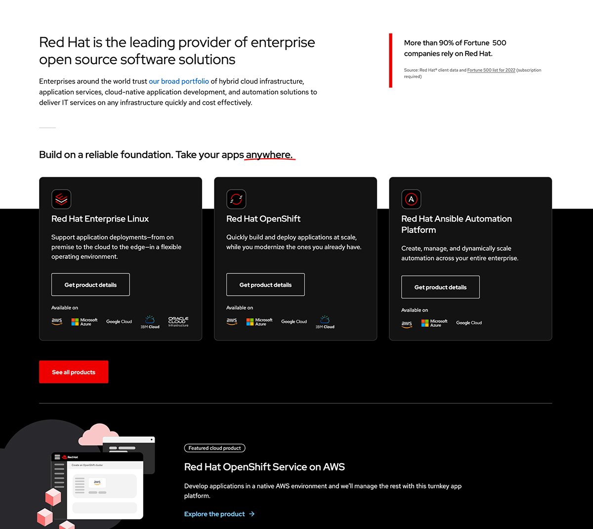
The homepage project started with a practical goal: highlight a new product by clearing space. We had been featuring dozens of products in the hero zone. We moved to three platform cards plus one rotatable highlight slot, and sent everything else to the All products page.
Analytics already showed strong traffic from that zone into All products, so the change reduced governance load for maintainers without closing off discovery. After launch, engagement dipped—the bolder layout and all-white treatment felt flat—so we nudged cards slightly out of their container. A small adjustment, but it brought clicks back.
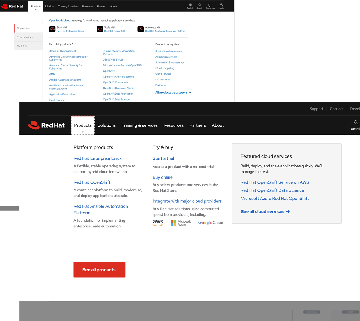
Product navigation
The global product navigation redesign paired with the homepage work. The old pattern was a wall of products—low engagement, high maintenance. The new dropdown keeps top-level platforms visible and routes people to All products for depth instead of trying to show everything at once.
Fewer competing messages, clearer paths, less content governance. The homepage and nav changes were really one story about simplification at scale.
Resource page templates
I also led a redesign of Red Hat’s resource page templates—long-form collateral that had been PDF-first. We added a table of contents, breadcrumbs, clickable footnotes, and more flexible layout options so the HTML experience could stand on its own.

Research
Alongside the redhat.com work, I co-led in-person research at Red Hat Summit—sessions that fed back into navigation and homepage decisions and set a pattern for how the UX team works with customers in the field.