Web
These are web projects across twenty-plus years — enterprise documentation at Red Hat, contractor sites for HVAC and trades companies, and local organizations in Vermont. The scale varies wildly, but the pratice remains the same.
Red Hat projects
Most of this work lives on platforms that serve a lot of people, at scale, for years. My focus has been documentation and learning design — navigation systems, page templates, and content hierarchies — on surfaces with tens of thousands of daily readers.
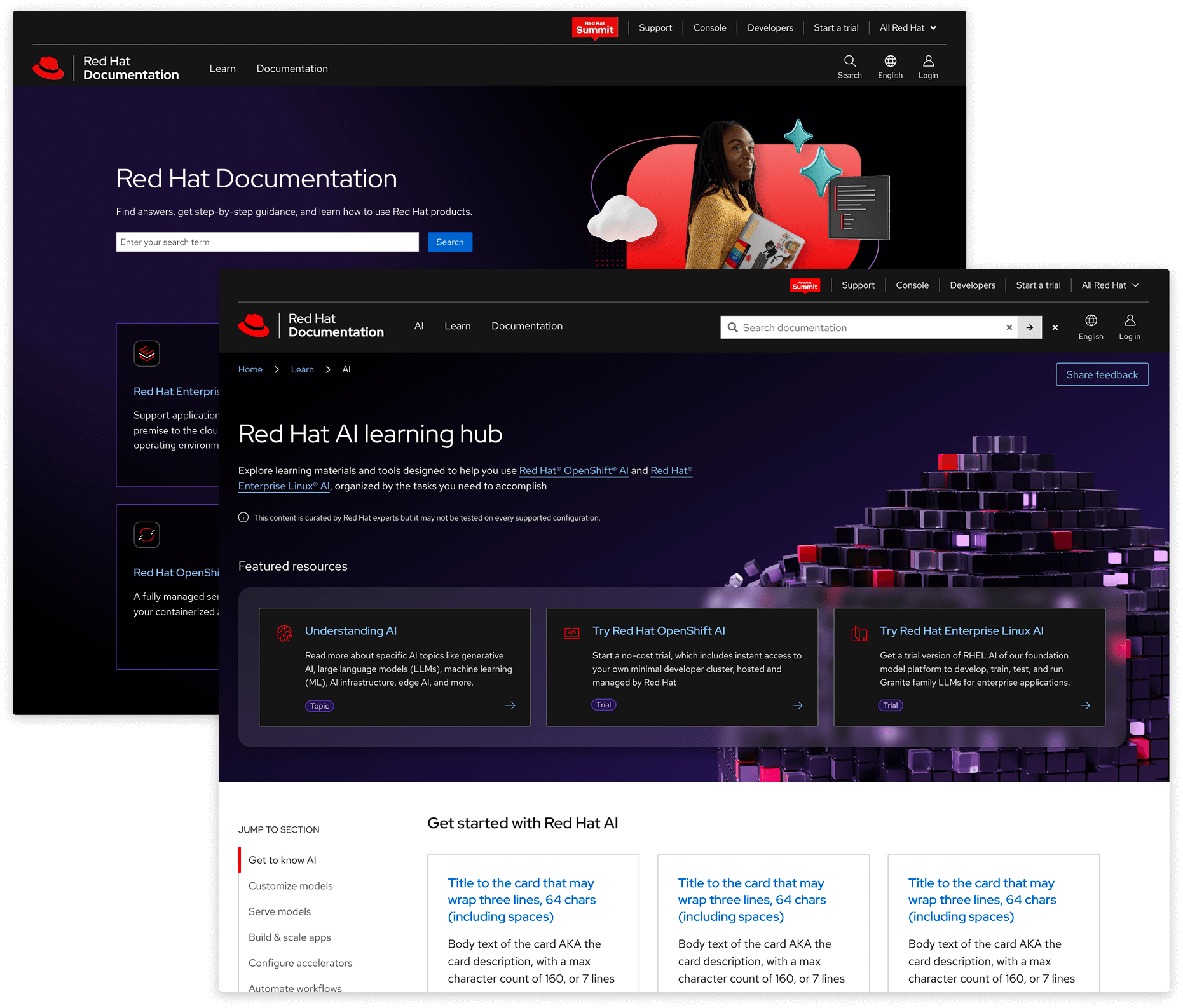
UX lead for docs.redhat.com — ~55k readers a weekday. The challenge is making technical documentation findable and usable for audiences ranging from experts to newbies who just cracked open a Red Hat product for the first time.
I've seen it through a domain migration and an expansion beyond docs into learning content. I also co-led in-person research with users at our yearly Summit conference 3x. Most of the work is systems-level: navigation hierarchies, table of contents patterns, page templates — the decisions that make a docs site usable.
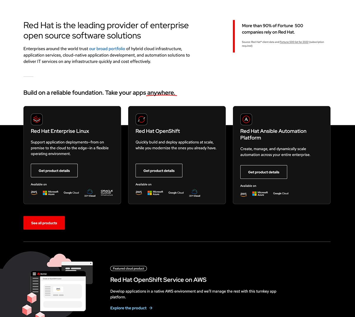
UX lead for homepage redesign. ∼7k vistors/weekday.
The project's goal was to highlight a new product by simplifying. Previously, we featured 50 products here. This adjustment moved them to the All products page, leaving the three platforms and a spot for a highlightable product. We had data that the All products page was highly clicked from this section previously and making that move meant less governance for maintainers.
The dark section above used to be all white. In the first phase the cards did not break out of their container. The data after launching showed us that engagement was low—a small, cheap adjustment of nudging them up brought those numbers back up.
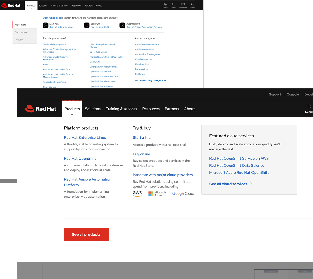
Led redesign of the product nav dropdown.
This was a reaction to low engagement on the 50 products that used to be featured here. The new version directs folks to the "All products page" instead. It's touted as a success in simplifying.
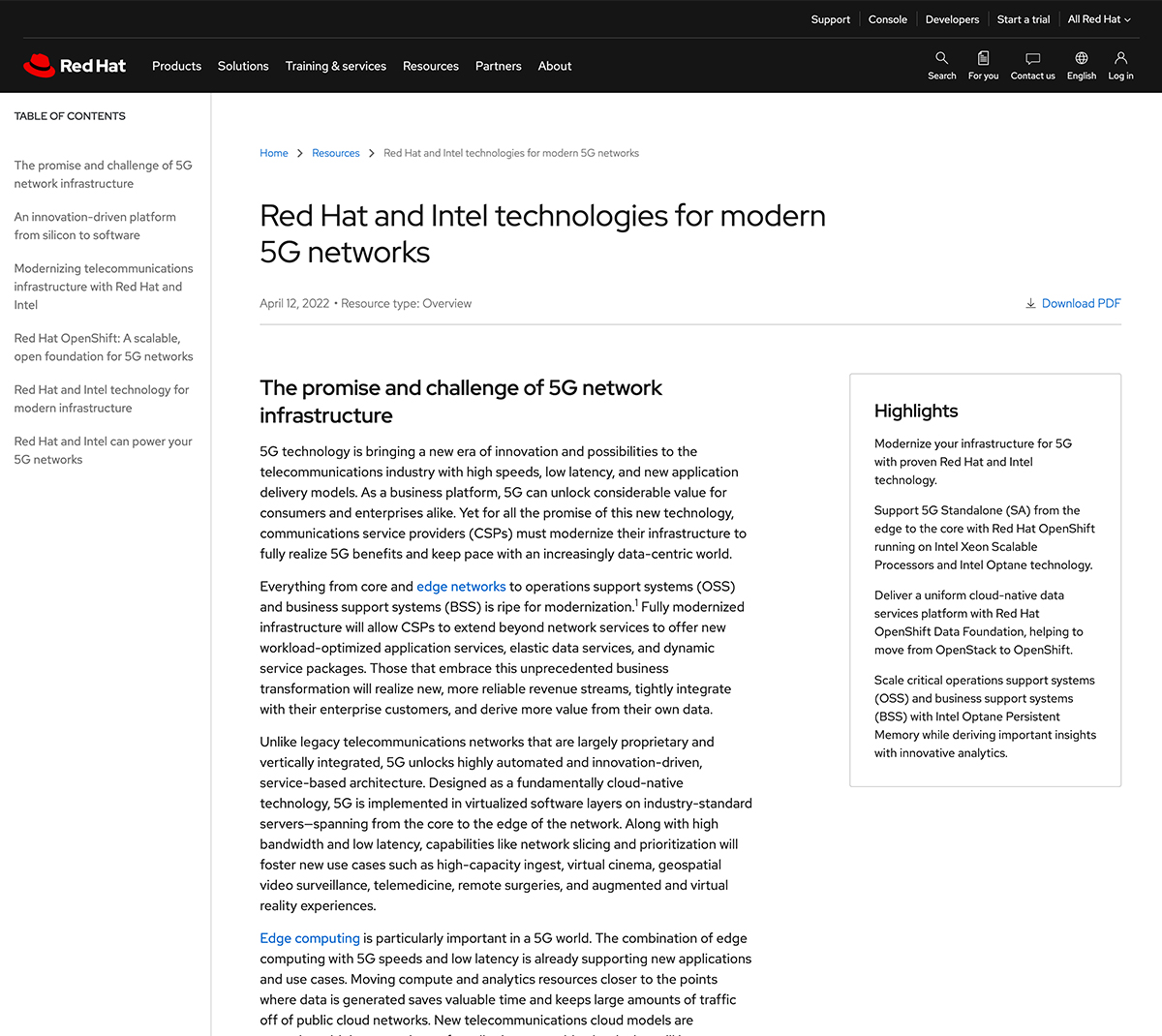
Led redesign of Red Hat's resource page templates — table of contents, breadcrumbs, clickable footnotes, better layout options. Finally, PDFs aren’t the only way to get information.
Sites for small, local orgs
Designed and built directly with clients as a side-gig.
Timeline: ~2 months. Design tool: Pen pot, figma, adobe xd. CMS: wordpress, squarespace
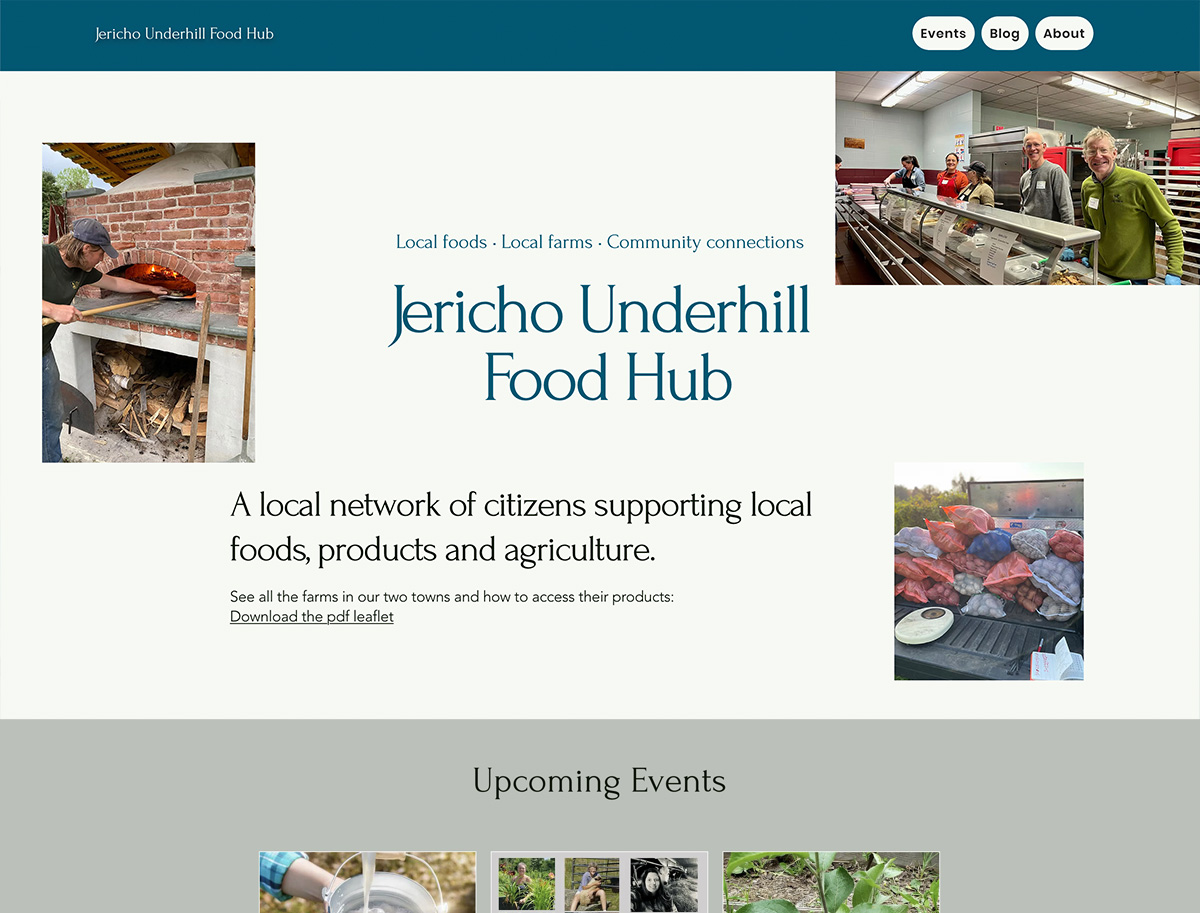
Website for our local food hub aiming to improve food resilience. We're a young org with big ambitions. More mature food hubs in the state offer commercial kitchens, small biz incubators, and food delivery for farmers. Built using wix.
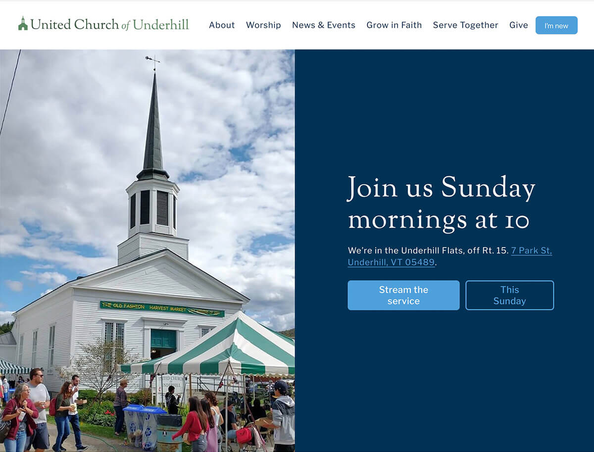
A church website that doesn’t feel like a relic from the dial-up era. Clear info, welcoming vibe, and a logo that scales.
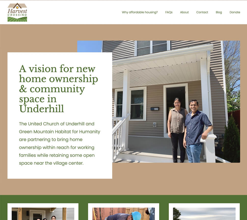
Branding and website for a local housing initiative. Homes should be affordable, and websites should be readable—mission accomplished.
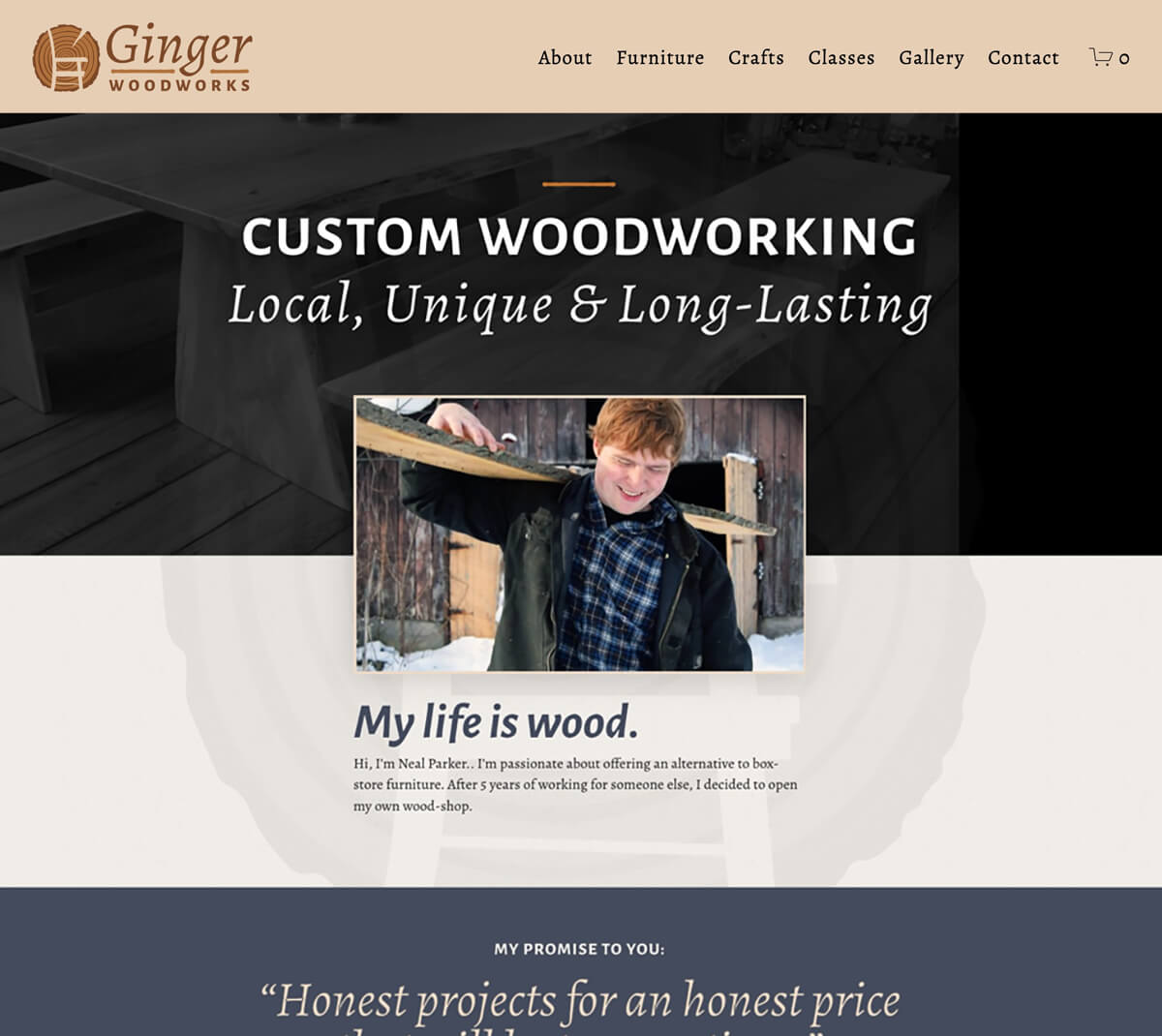
Brand and site for a custom furniture shop, featuring e-commerce. Less fluff, more craftsmanship.
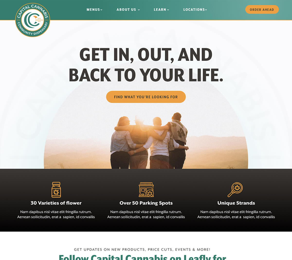
Dispensary in Western Mass that doesn’t scream “stoner aesthetics.” Together with CannaPlanners
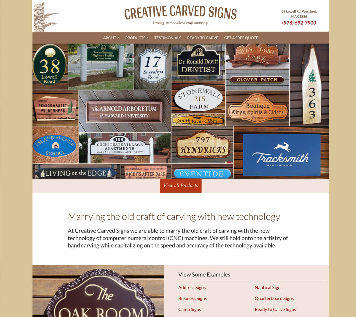
Launched 10 years ago and still going strong. What started as the side-project of a cabinetmaker turned into a full-time gig when the site produced steady work.
Sites for contractors
First designer at an agency specializing in contractor websites. The challenge: make similar structures feel unique without overcomplicating dev work. I speak developer, so was able to get my more bespoke ideas out the door via this collab.
Timeline: ~2 weeks. Design tool: adobe XD. CMS: ModX
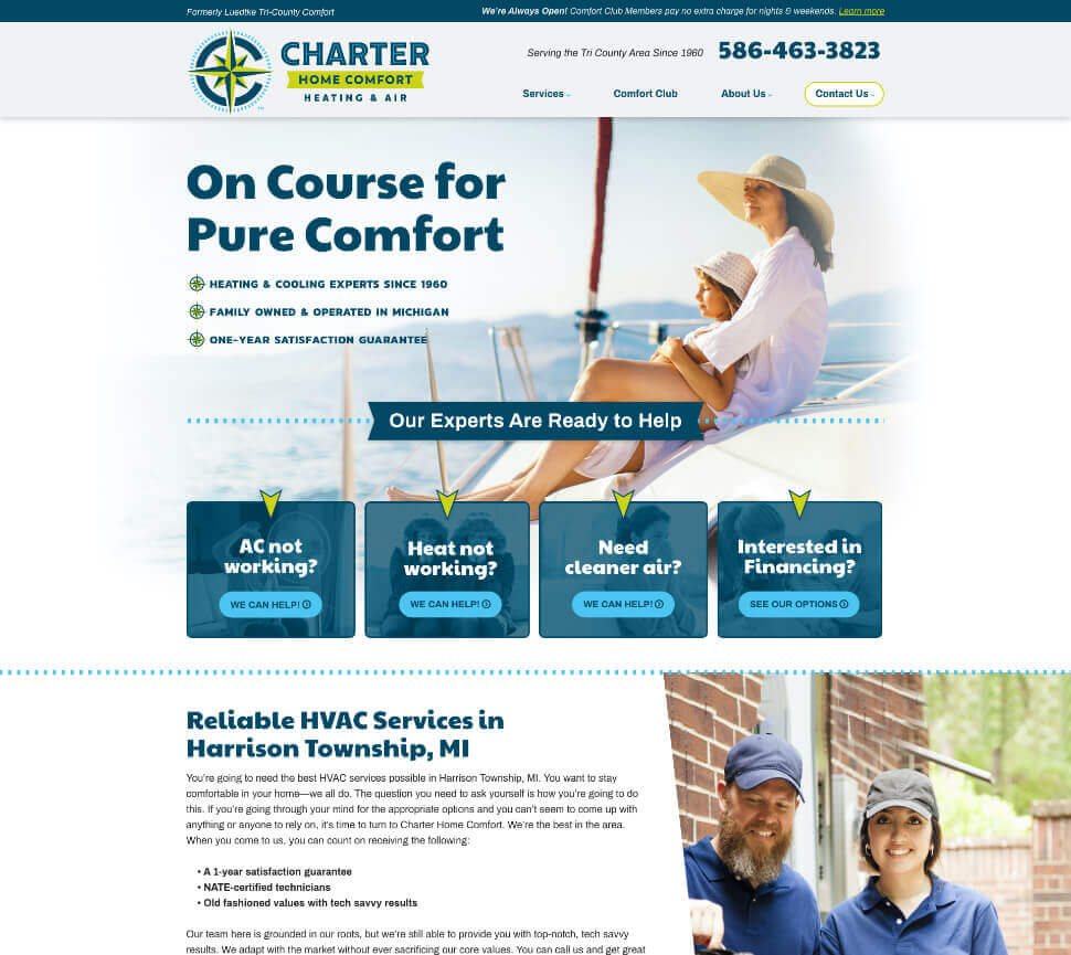
Charter invested in branding, and it paid off. Nautical themes, strong visuals, and a site that reflects their company.
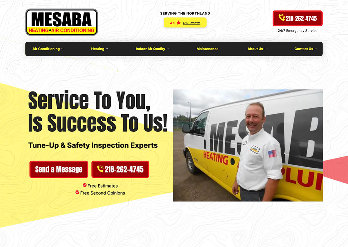
The Iron Range mountains were an important to the client. I introduced a new typographic element as well as local imagery to speak to that, expanding the capabilities of their once text-only brand.
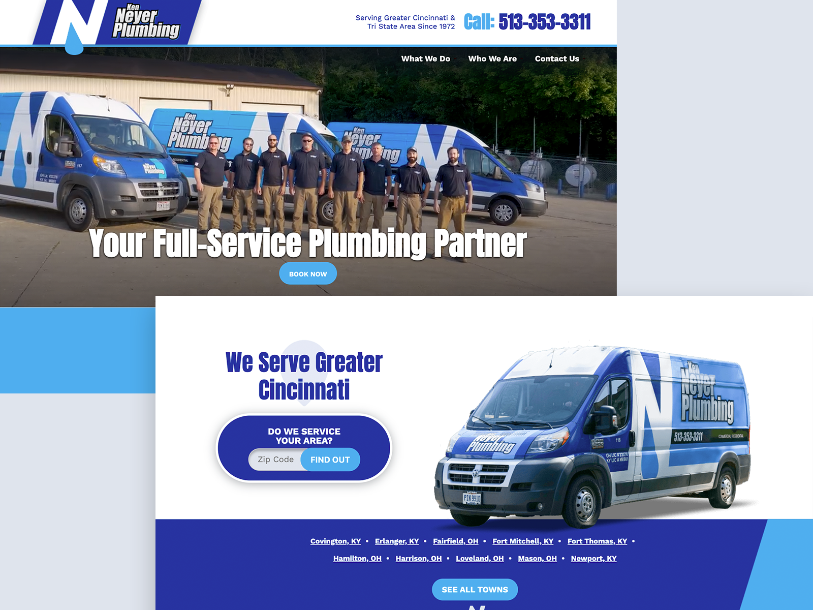
Professional photographs wildly elevate the site’s impact. The color repetition, angle, and video in the hero are the icing on the cake.
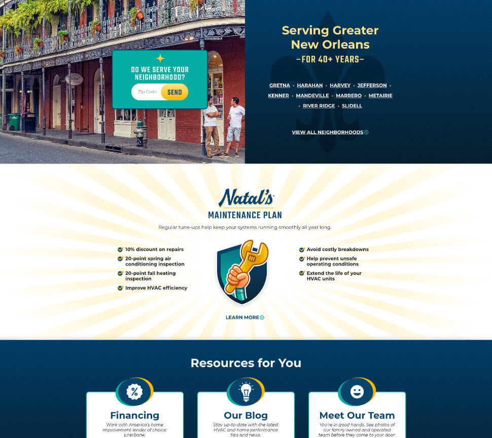
Google Fonts were the only option, so I cheated—graphic elements mimic custom typography without breaking the rules. Additional items I contributed to the brand: shield icon, sparkle-stars, sunburst, and stripes.
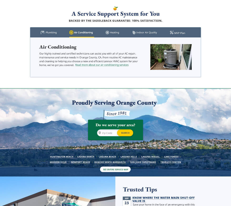
Contractor websites don’t usually do serifs. That’s what made this one stand out (plus a few animations to keep things lively).
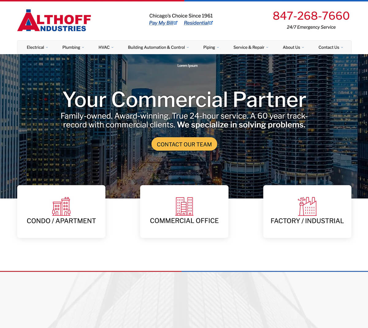
Residential sites tell a story, commercial sites close deals. This one does both. The font Libre Franklin ties with the sans-serif in the logo, but provides a more warm and inviting appearance, and elements that stand out like the double-story lowercase "g."
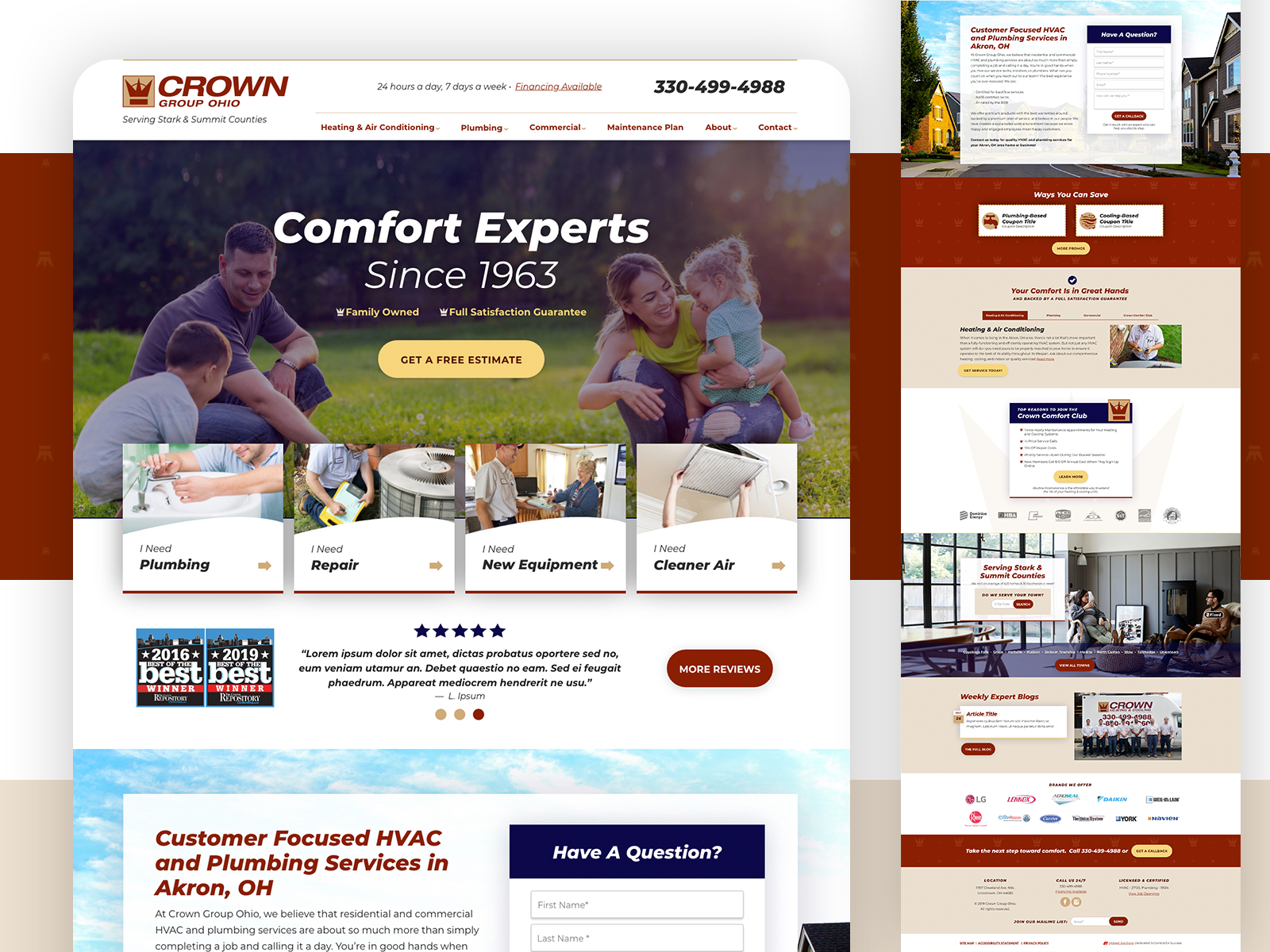
Sometimes a logo is all you get. Here, I turned an italic Helvetica wordmark into something engaging.