Home services agency
First UX designer at shop, product improvements, and CRO for home services contractors.
From 2014 to 2021 I designed at iMarket Solutions, a Burlington agency focused on digital marketing for home services contractors, like HVAC, plumbing, electrical companies.
My focus and interests:
- Custom UI design and art direction: working with clients on individual site designs
- Product improvements: site-wide updates, including creating a mockup tool
- Design ops: glossaries, conversion principles, portfolio for sales, onboarding docs
- Conversion rate optimization: analytics, heatmaps, company-wide protocol
The day-to-day design appears repetitive on paper. While each project had the same structure, their branding, imagery, and audience shifted with each client. The constraints enabled inventiveness. Each project required collaborating and coordinating with the client and four teams (development, content, design, and SEO).
Designing at a niche agency is a longer write-up from that period, with service-carousel examples, before/after upgrades, and sites still running years later.
Sample projects
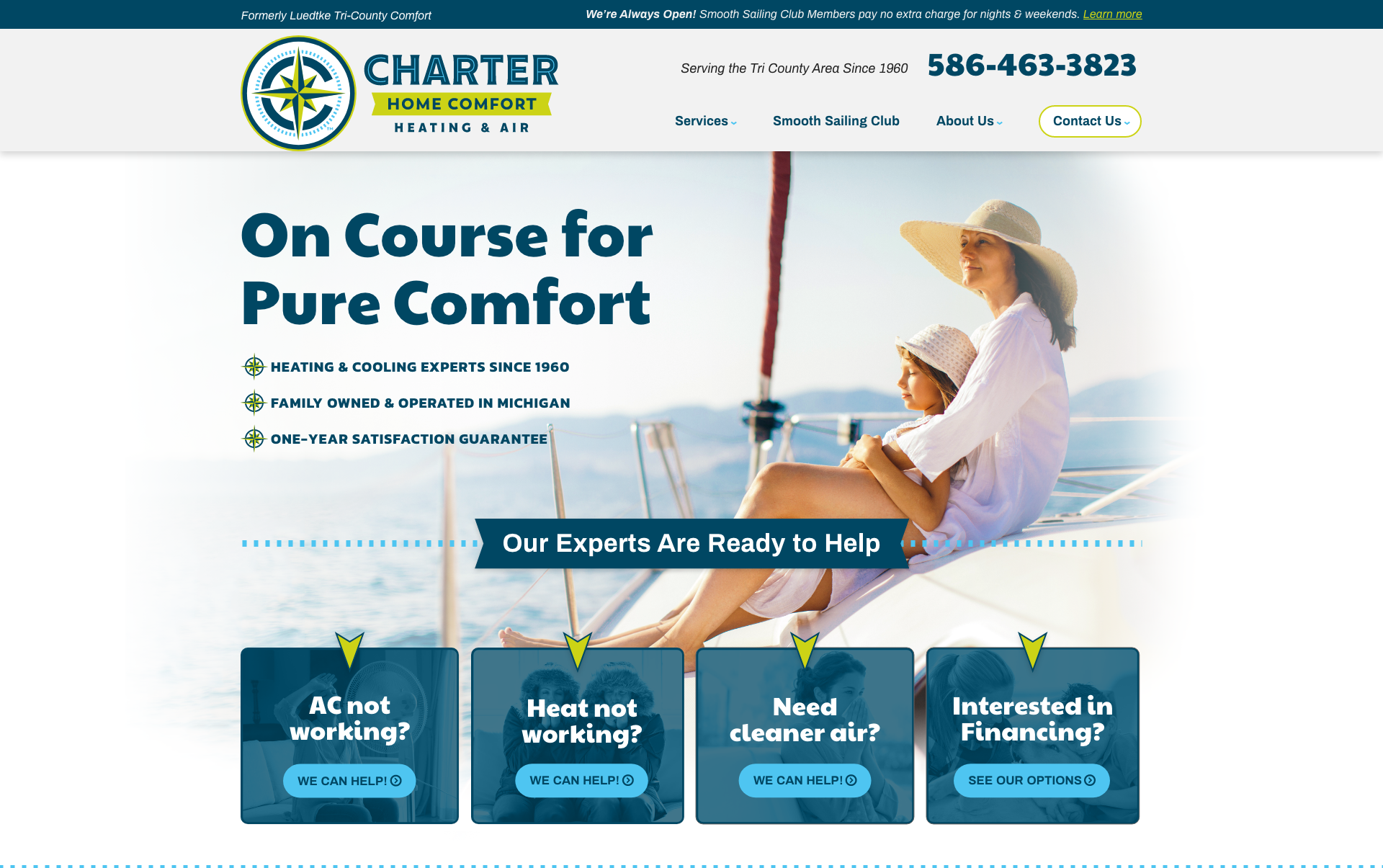
Charter
Charter came in with a fresh rebrand, while going through a name change. On a video call I learned how far they wanted to lean into the nautical theme (pretty far). Their main concern was easing loyal customers into the new brand.
I designed the site pulling structural patterns from our library and customizing micro-patterns for their look. I also built a rich style guide from their brochure and logo so the brand could extend to a maintenance-plan, print, and social posts other teams could riff on.
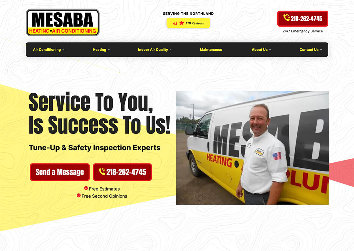
Mesaba Heating
The Iron Range mountains were important to the client. I introduced a new typographic element as well as local imagery to speak to that, expanding the capabilities of their once text-only brand.
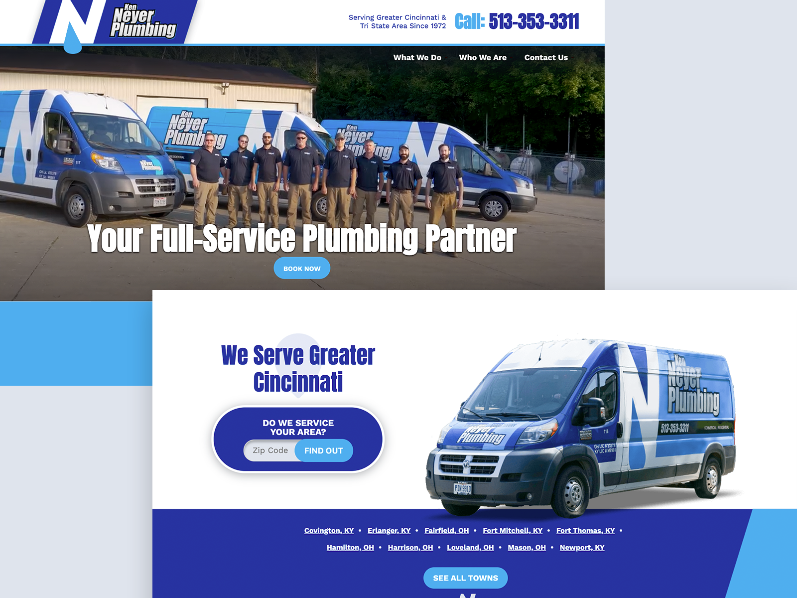
Neyer Plumbing
Professional photographs wildly elevate the site’s impact. The color repetition, angle, and video in the hero are the icing on the cake.
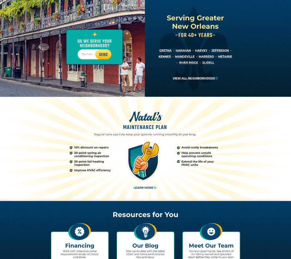
Natal's Air Conditioning
Google Fonts were the only option, so I cheated—graphic elements mimic custom typography without breaking the rules. Additional items I contributed to the brand: shield icon, sparkle-stars, sunburst, and stripes.
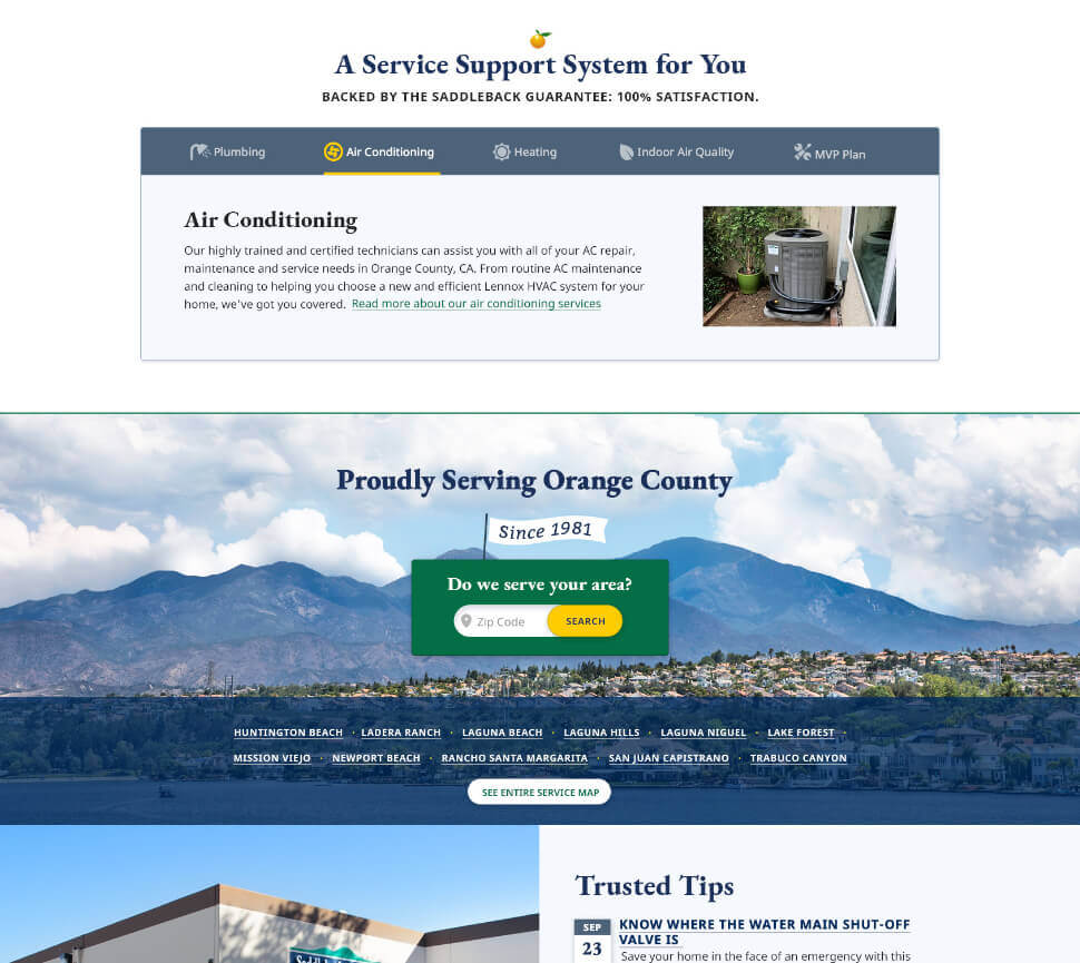
Saddleback Plumbing
Contractor websites don’t usually do serifs. That’s what made this one stand out (plus a few animations to keep things lively).
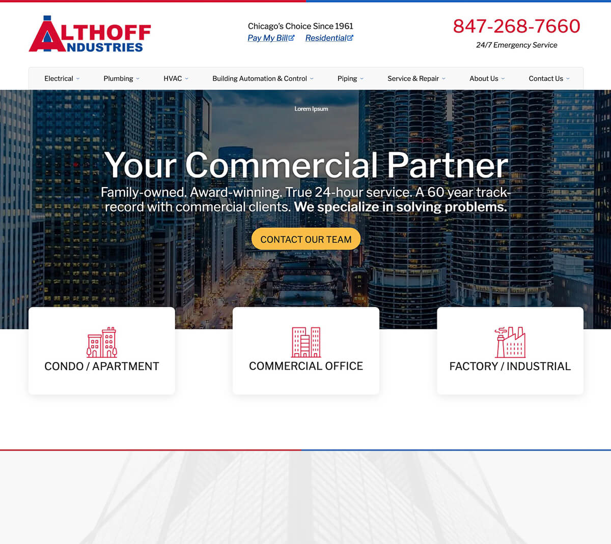
Althoff Industrial
Residential sites tell a story, commercial sites close deals. This one does both. The font Libre Franklin ties with the sans-serif in the logo, but provides a more warm and inviting appearance, and elements that stand out like the double-story lowercase “g.”
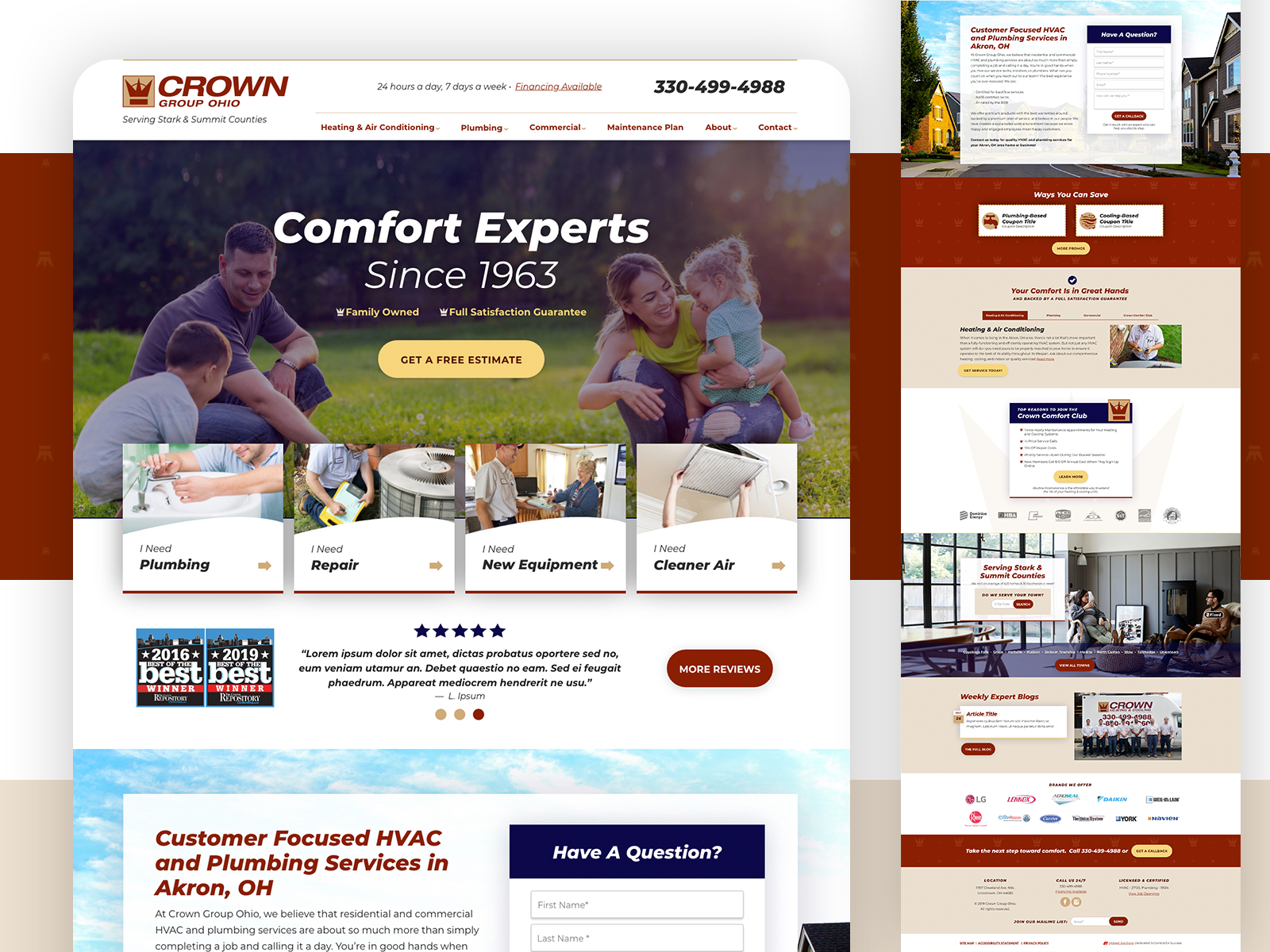
Crown Group Ohio
Sometimes a logo is all you get. Here, I turned an italic Helvetica wordmark into something engaging.