Designing at a niche-agency
Republishing an old post about working as a ux designer at a small burlington agency
(At the time of this writing, my role I had been a ux designer for 3 years after having spent 1 year before as a developer.)
In a nutshell...
I helped literally hundreds of contractors succeed by providing custom site designs.
Below are my contributions.
The 4 big ones were Custom UI Design / Art Direction, Product Improvements, Documentation, and Conversion Rate Optimization.
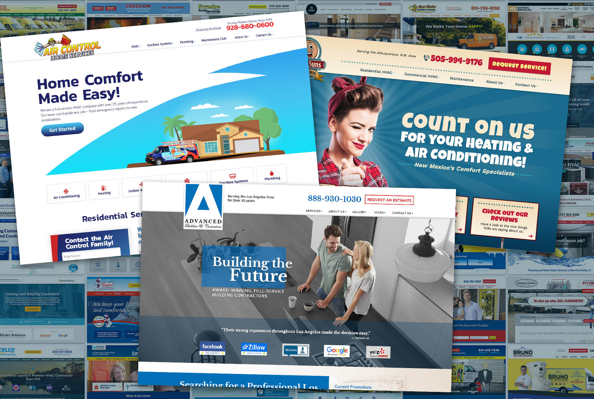
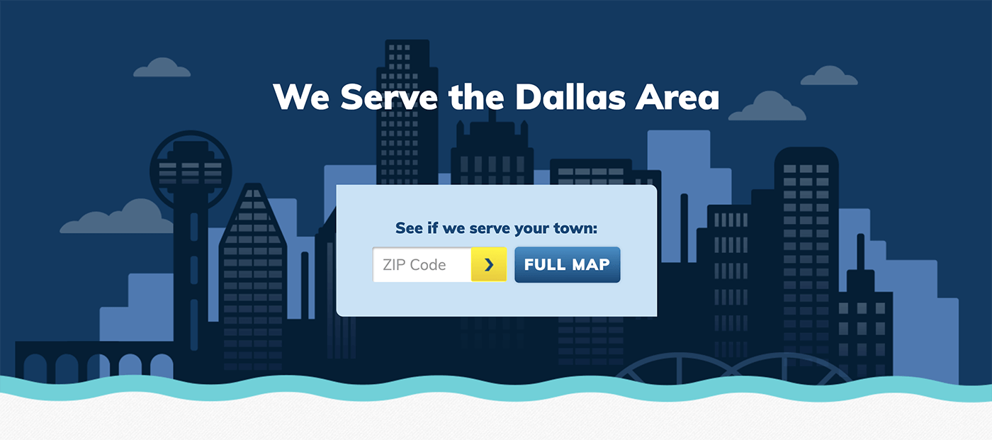
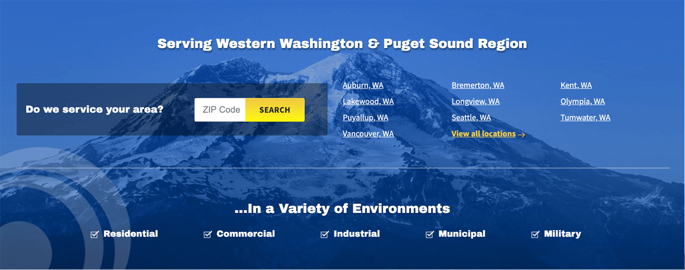
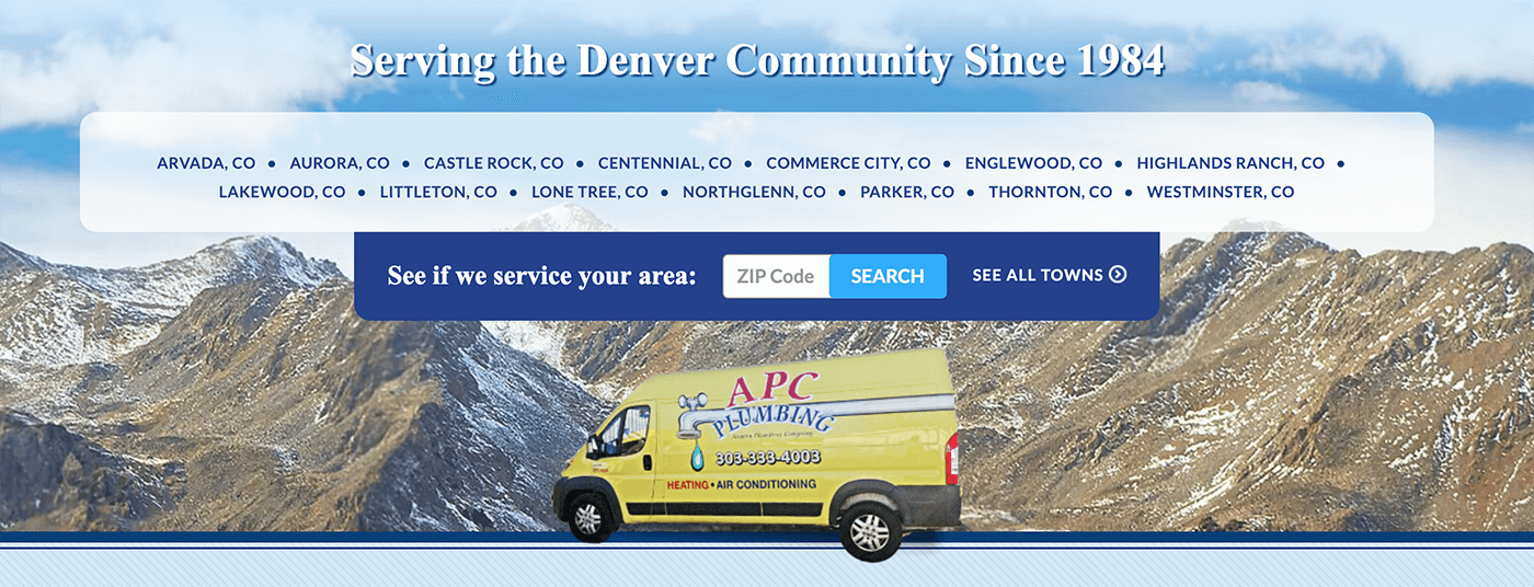
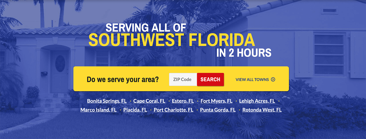
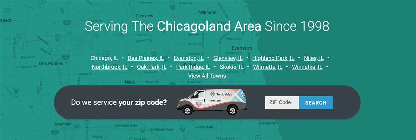
The Company
They offered marketing and strategy to small to midsize contractors. They have over 300 clients and earned the Inc 5000 the last 4 years. It’s made up of 42 people between offices in Vermont and California, and remote workers.
They’ve matured much since I joined at their 4 year mark. Silos of design, development, and content have eroded reducing the lorem ipsum I put out into the world. They’ve become discerning when choosing clients, have shortened site-build time tremendously, and even have plans to hire an HR role.
1. Custom UI Design / Art Direction
Constraints stimulate innovation. No, really.
My primary charge was to design sites that provided leads. Making that phone ring. Making those forms complete. It was essentially the same site over and over again. That constraint supported my growth as a designer as it encouraged resourcefulness and inventiveness. Other constraints were annoying at first but ended up giving that little push toward innovation, such as:
- Only using Google Fonts
- Rigid content requirements for SEO strategy
- Quality of client photography (we did all we could to avoid stock photos)
- Quality of client branding (we didn’t do identity. I did touch up logos under the radar. I was thrilled when we'd get a client who had professional branding, like from kickcharge. I knew they'd already invested in branding and, thus, knew its value and the assets would be in the right format and thorough.)
Deadlines
Each design was on a tight, 3-day deadline. As the team matured, we were able to tune in the processes and decrease that turnaround time. With the client expectations and branding assets in hand, I went to Photoshop (later, xd) to create a homepage and subpage design. I wore an art direction hat to evoke the right emotion for our client’s audience and a UI hat to execute that connection using visuals.
Although the content structure and sitemap were the same every time, the design was unique, so developers had to code the nuances for each one. The more I knew what the developers were capable of, the less back-and-forth we had. That knowledge also aided when meeting with customers about their wild, un-codable ideas. I’d help nip it early and guide them toward something doable.
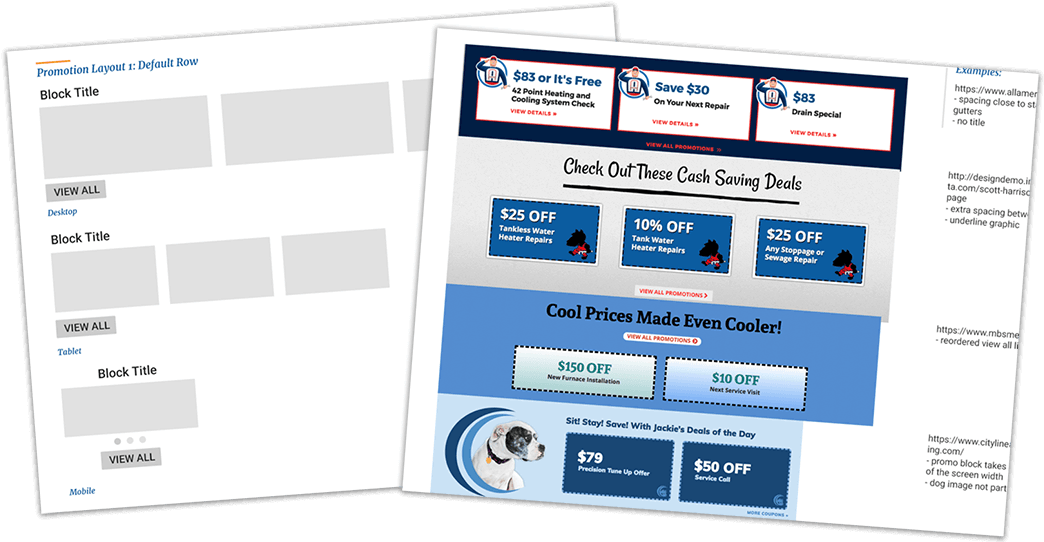
Patterns?
To save time and join the rest of the industry, the devs and designers joined forces to create a pattern library. The plan was to patternize every piece of the site. To accommodate the differences, the system would need to be flexible and need many variations.
We built the structure and were giddy about the calculated time we’d save. But, the team quickly realized that fine-tuning a single pattern was labor-intensive and ate into time for client work. This surprise stifled the energy and put it on pause until more people were hired.
For the sake of harnessing some of that energy, the design team chose certain patterns to reuse internally. We reeled in our creativity. We built fewer new things, referencing to devs what had already been launched. It saved time and was a decent half measure.
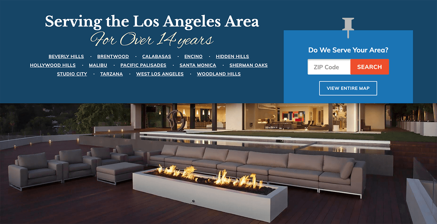
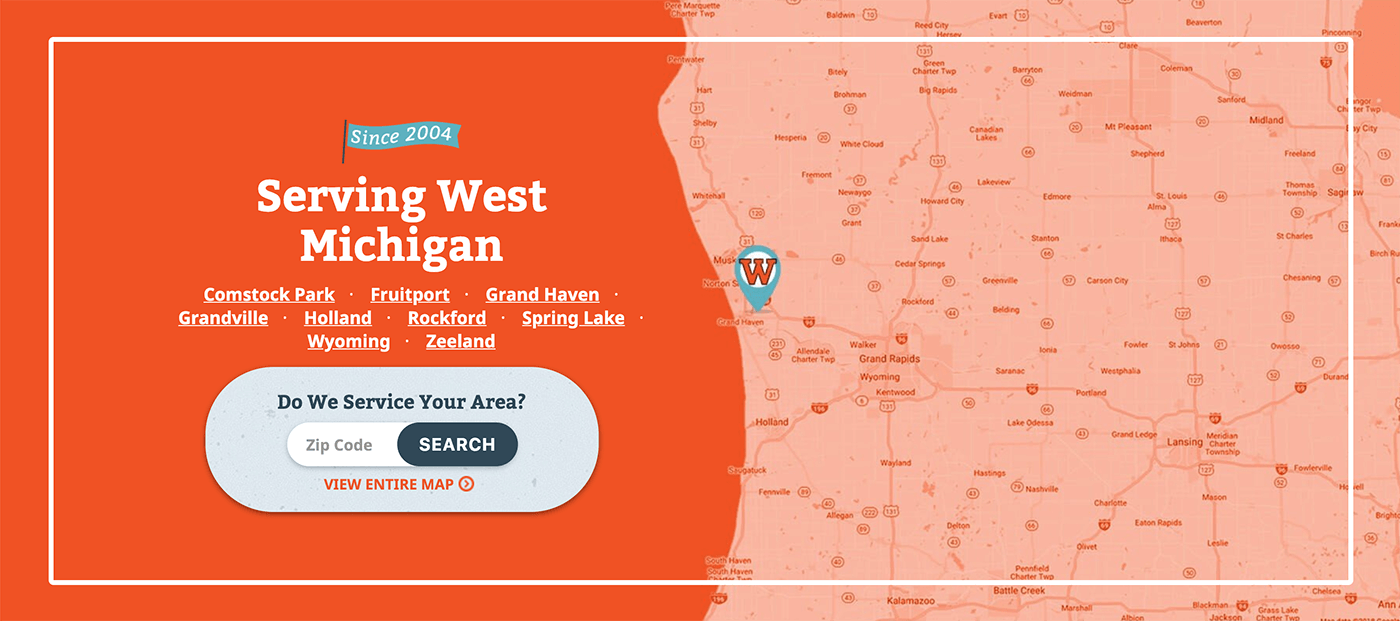
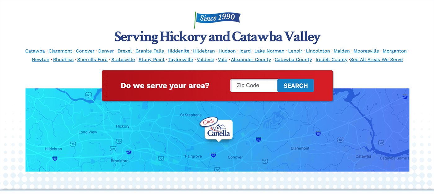
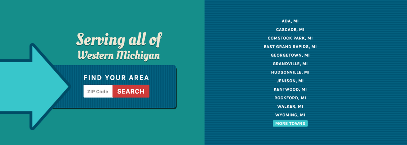
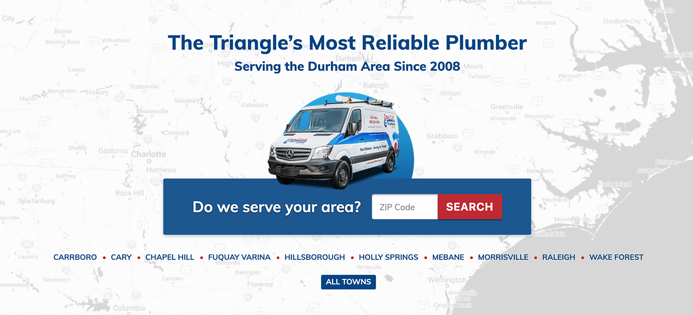
Example blocks
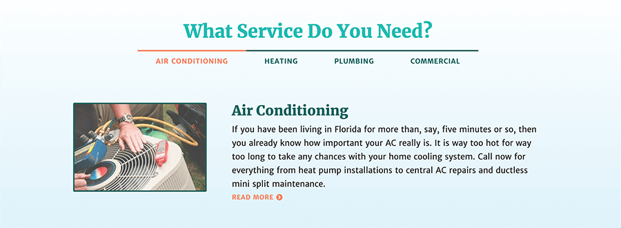
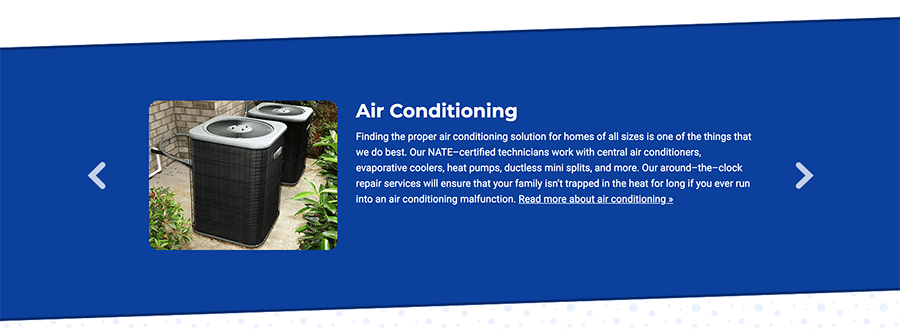
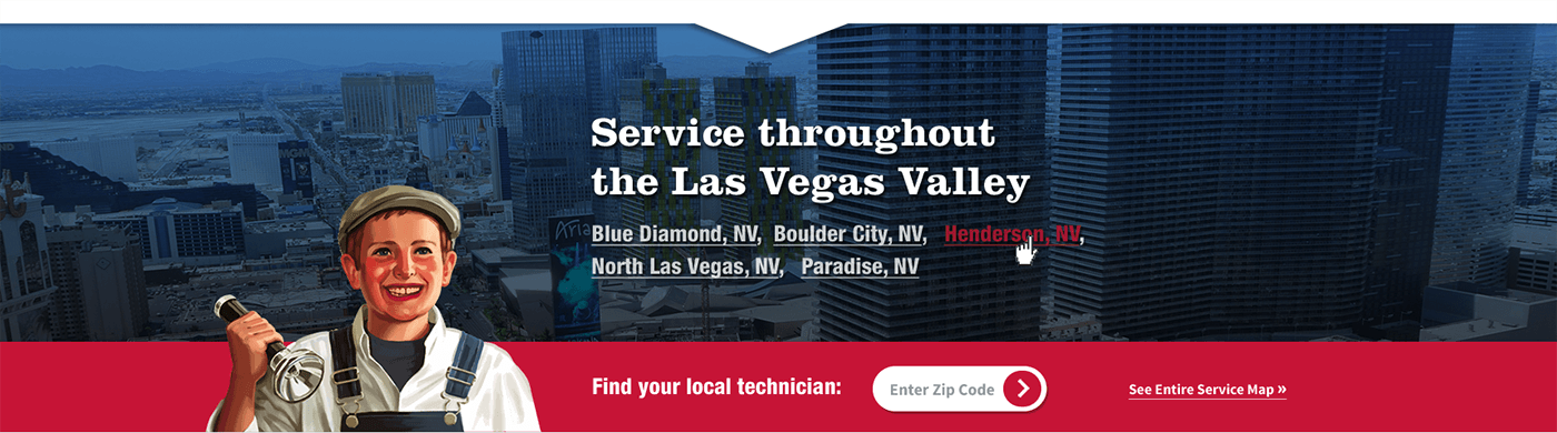
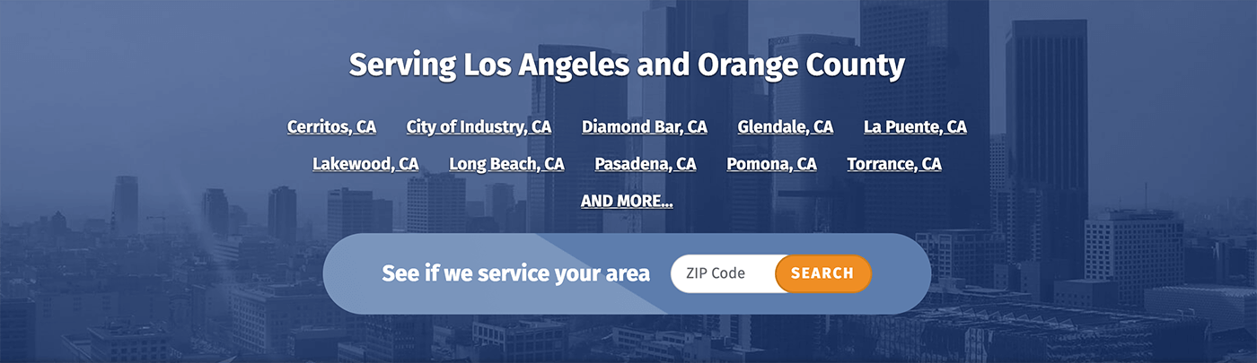
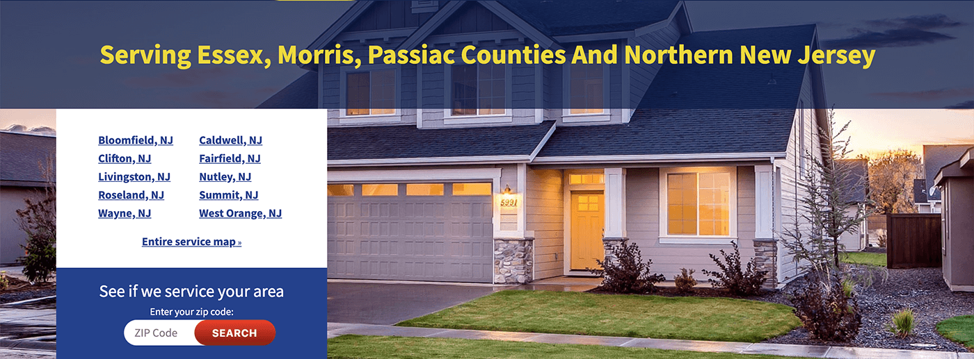
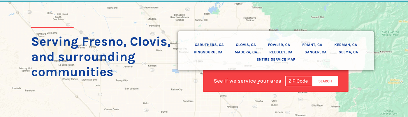
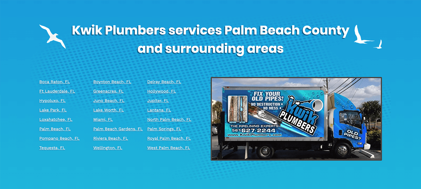
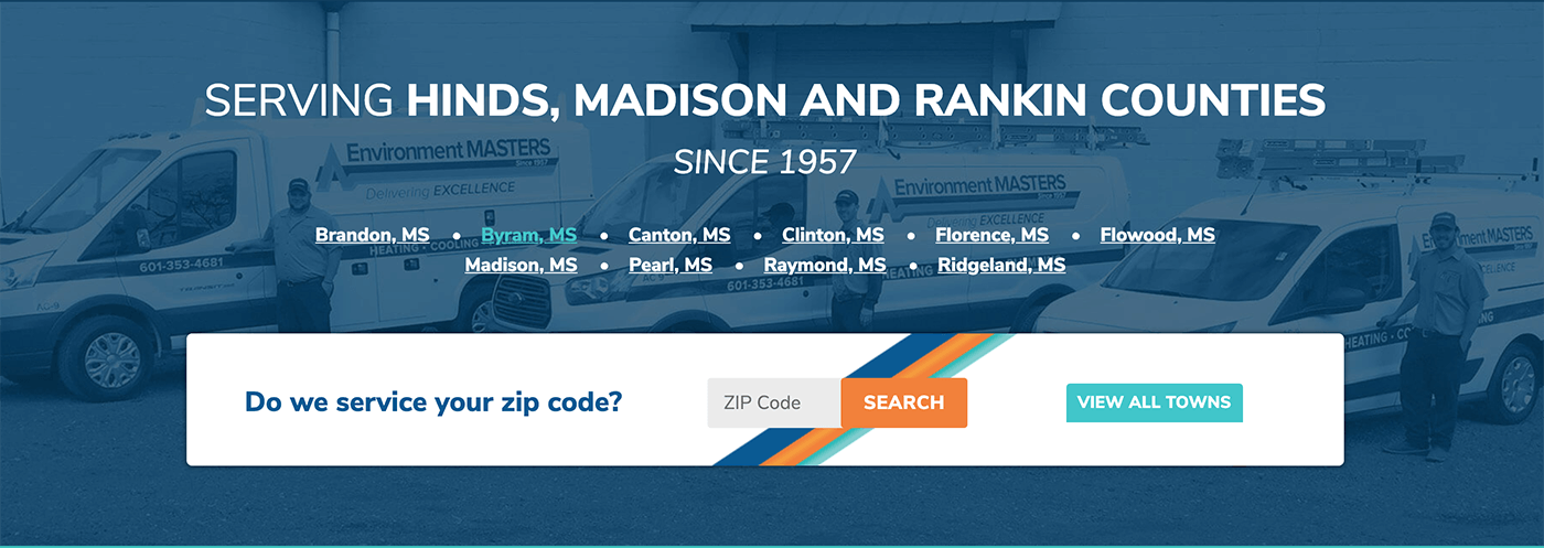
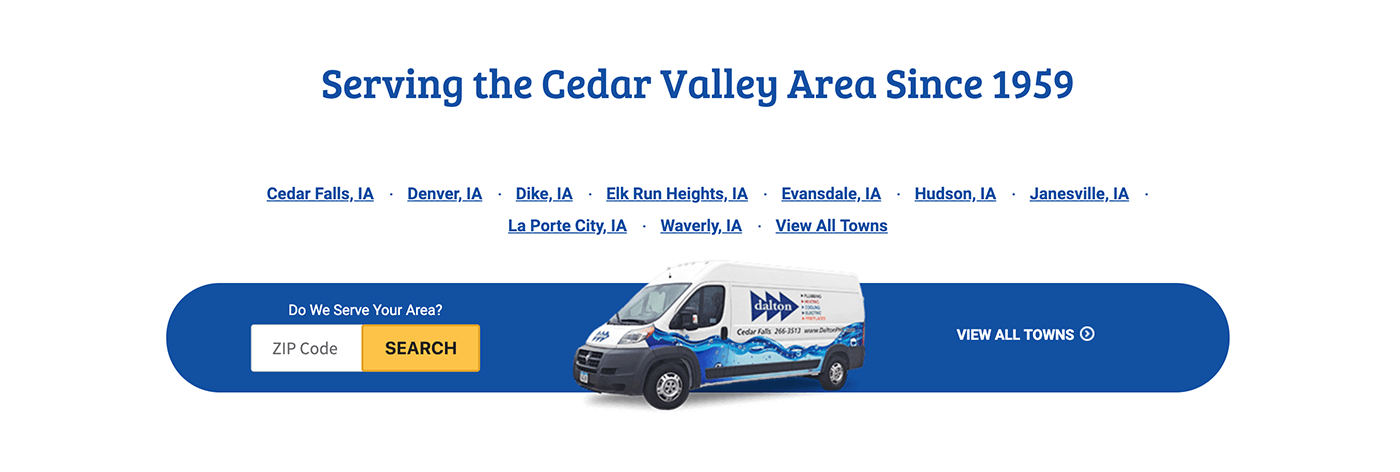
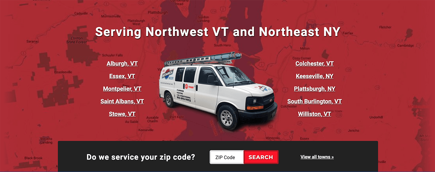
To show my various solutions to the same content, here’s an exhaustive list of Services Carousel examples. To dig further into one client, check out the nautical-themed Charter work on the web design page.

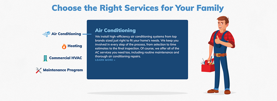
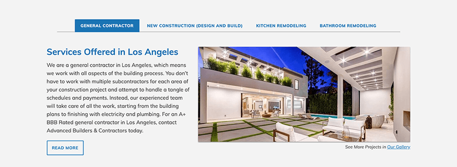


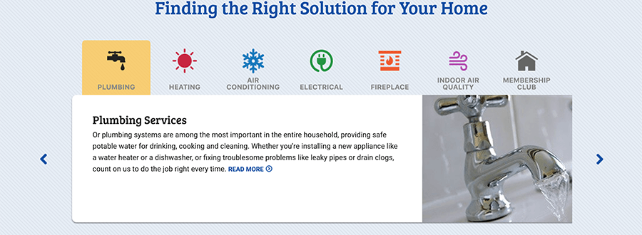
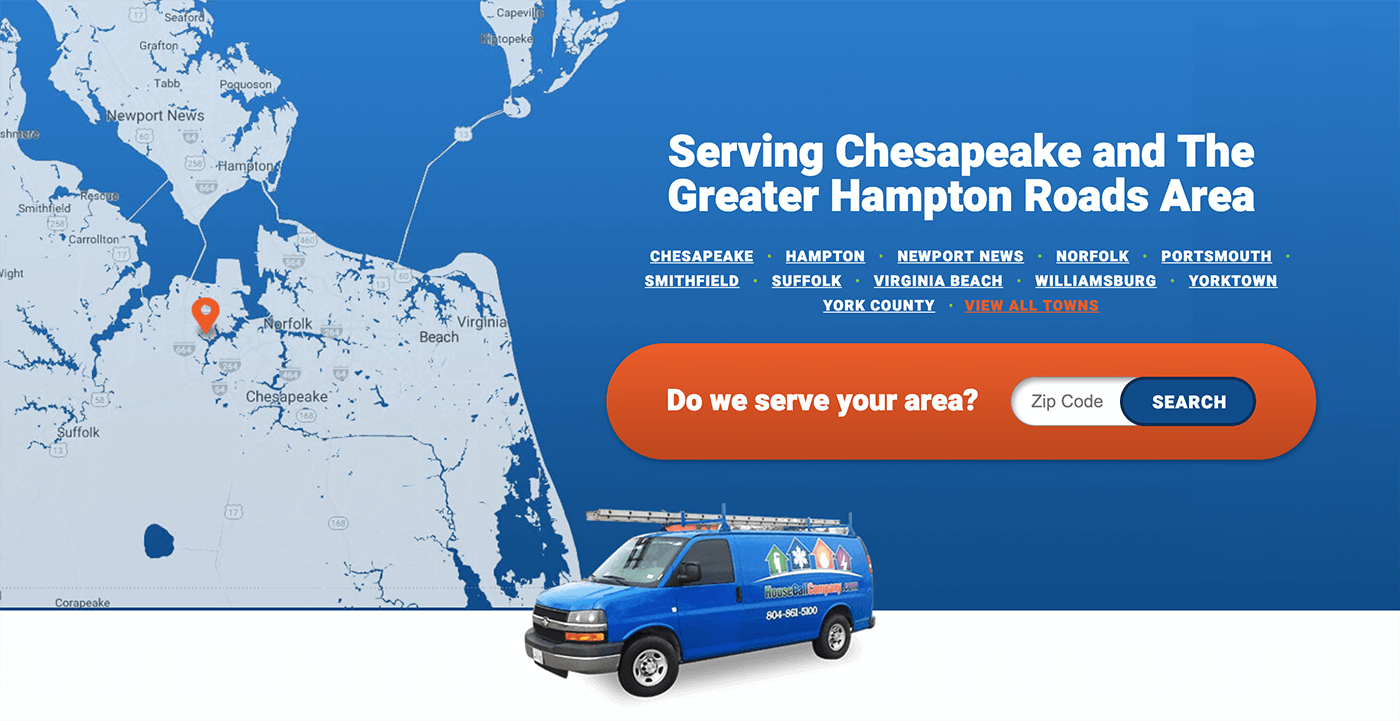
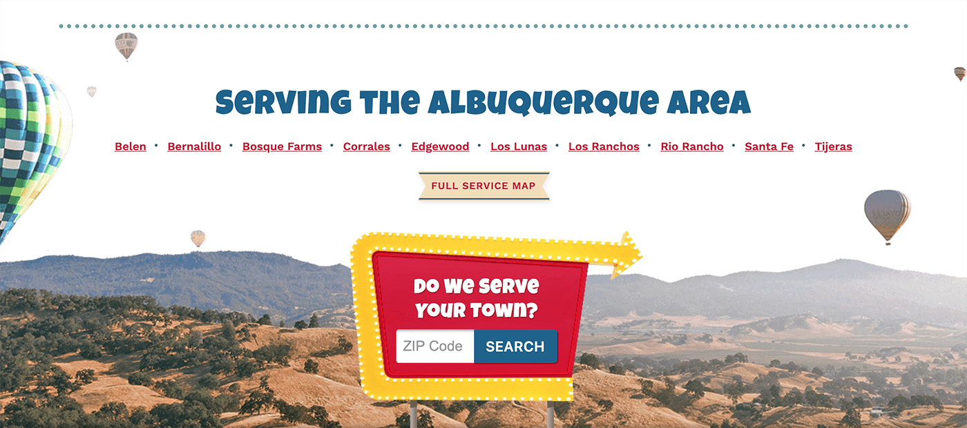
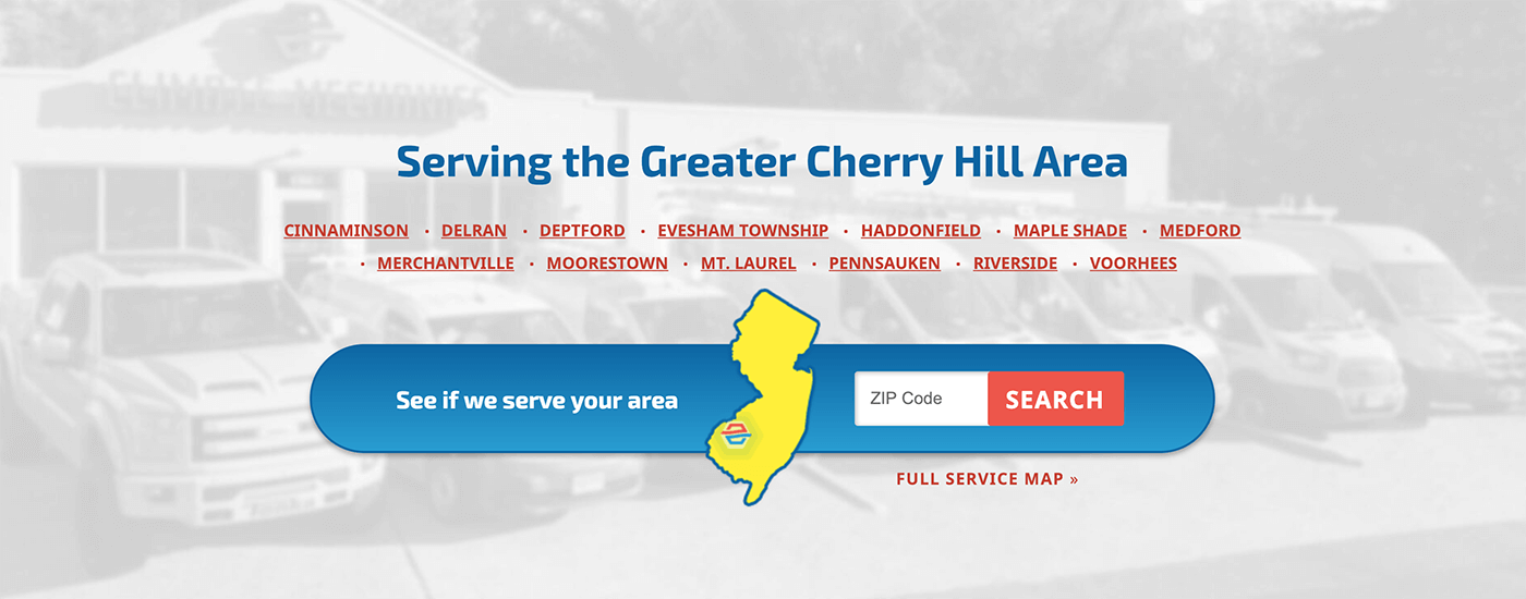
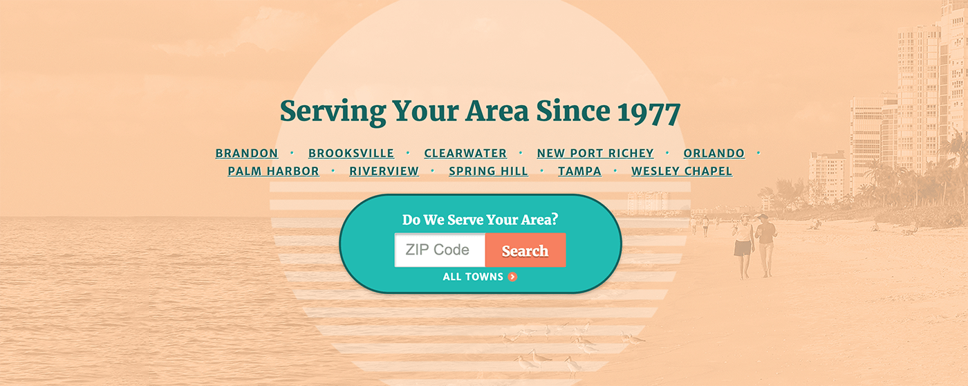
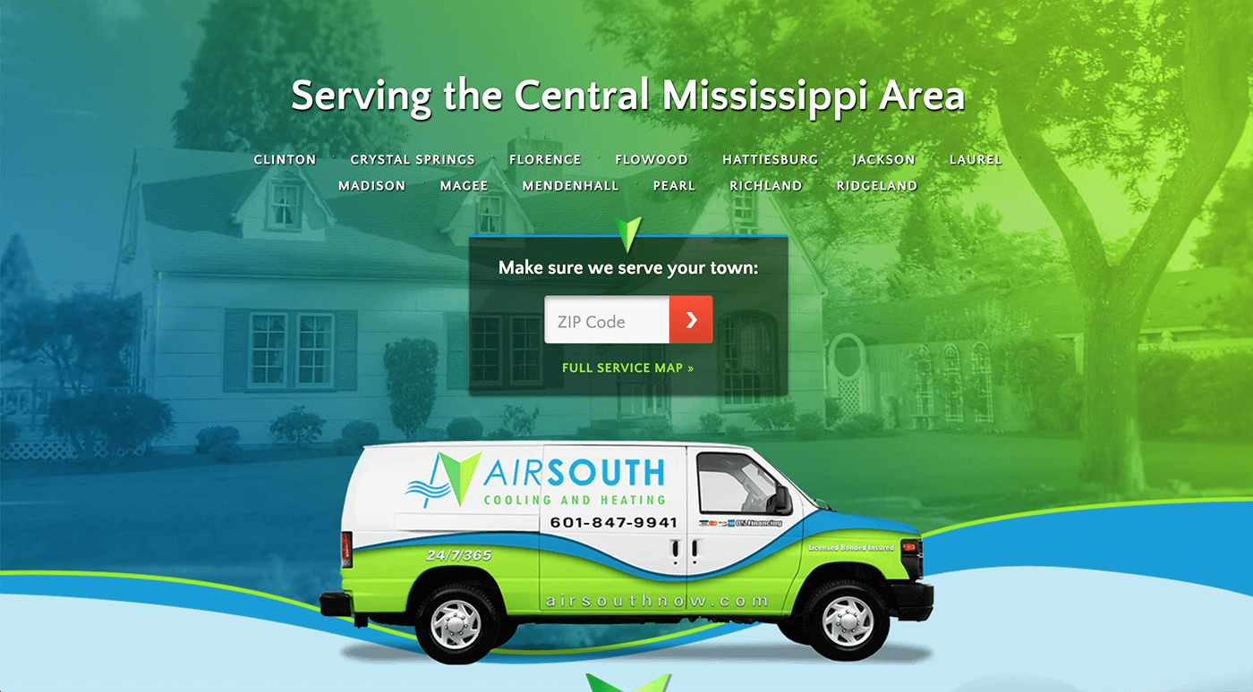
and some Service Area examples:
2. Product Improvements
Bigger breakthroughs took place outside of client deadlines. Often, innovation begins with questioning the norm — this is my bread and butter. My improvement highlights include:
- Rejuvenating legacy pages
- Adding a high-converting mini-form to all pages
- Introducing grids
- Upgrading a mockup display tool
- Building live prototypes design proposals (ex, form updates to include float labels and expandable fields)
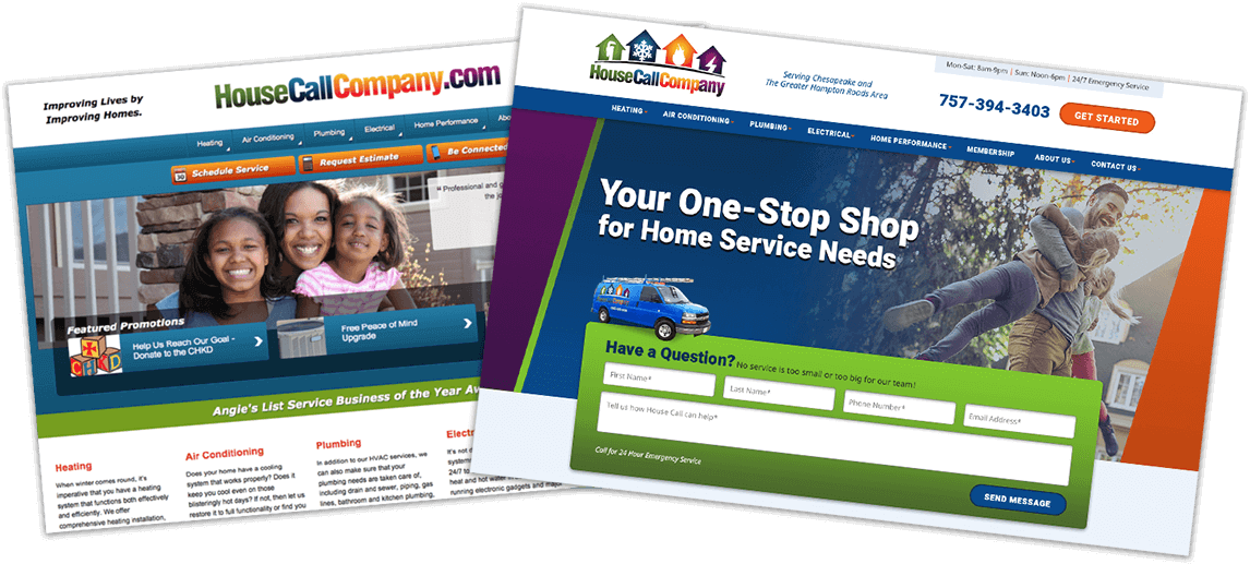
When I started, the designs were not yet part of the responsive bandwagon. Now, because of incremental updates, I can honestly say our sites have a stronger design and are faster than most competitors. Here’s the collective process each update follows:
- Brainstorm with Design Team
- Create proposal for stakeholders (Customer Experience, Development, Programming)
- Iterate with everyone involved
- Deliver proposal and test
3. Documentation
I was the first designer in our department. As we grew to 3, it became crucial to share what was in my head with the team. This helped not only with onboarding new designers, but also in bringing design into the open and giving it a seat at the big table. I wound up really enjoying the governance part of the role and saw it as democratizing knowledge. Sharing the wealth of knowledge hoarders with the masses, so to speak.
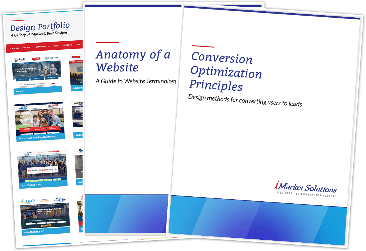
I created key document that unified our messaging in-house and when talking to clients, such as:
- Conversion Optimization Principles: 9 high-level design principles
- Glossary: the name and use of every website piece
- Design Portfolio: website of selected designs and words to use when talking to prospective clients
- Client Media Guide: tips on capturing and delivering high-quality images and videos
- Design Documentation: the departmental wiki
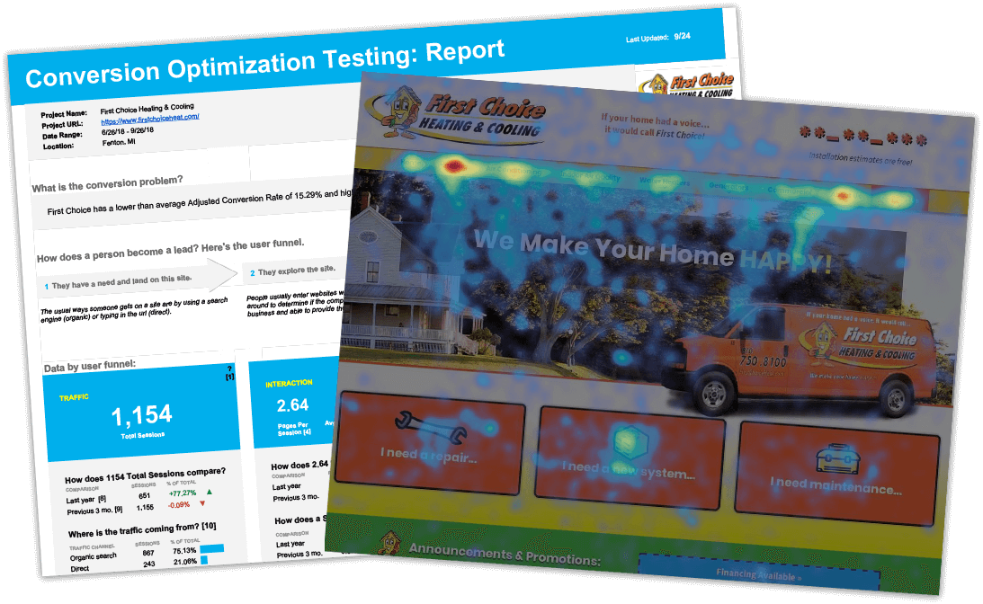
4. Conversion Rate Optimization
I lead a project introducing Conversion Rate Optimization (CRO) to the company. The outcome was a protocol for researching analytics and heatmaps to find opportunities for CRO. After following the process, you end up with a hypothesis for a high-ROI design change. Then, you present it to the client, put in place, and test the results.
I loved the union of data-informed and gut-informed design. I’m proud of this project because its potential was evident. It resulted in the formation of a CRO team and a plan for a stand-alone CRO product.
The stuff of teams
Here's the disclaimer that every accomplishment with my name on it should have a giant asterisk thanking others. Looking at you Development, Programming, SEO, CX, SEM, Content, Email Marketing, and Social Media.
Launches (from 2018) and legacies
In the world of the web, legacies don’t last long. It’s rewarding to see sites you built still live years later—it means they’re doing their job. Losing a client to another agency was always a letdown, but they often carried over my design decisions (which they had every right to do). The work was portable: style guides, textures, backgrounds, flourishes, the overall vibe. Cheesy as it sounds, it felt good knowing the work would live on in some form.
Resource dump
- Icons: flat icon, noun project
- Curated blogs of people getting creative with google fonts, type wolf, 100 days of fonts, hello happy
- Consistent swanky css: codrops
- Coolors - The fast and friendly ui color palettes generator!
- Snazzy maps: for custom colored, vector maps. Also, mapbox.
- Open source resource hubs: open source design, toools