Research
I’ve sat on research teams at two companies and just relish seeing people actually use the site you spent months on. What's even better is asking them about it. Below are a few research projects I was a part of.
AB testing
Test 1: “Do shorter pages convert less?”
For this test, we wanted to challenge a norm in the company around content length. Our hypothesis was that less text wouldn’t hurt conversion rates. However, we encountered a barrier in that our page views were very low, so we bundled the test across five clients and aggregated the data. Our writers varied their strategies to provide an alternate view of certain pages.
Results:
- Growth in conversions by 16.65%
- No negative effect on keyword visibility after assessing the experiment 6 months after launch.
Impact:
- Reduced the workload for writers by half!
- UX benefits: users were able to get their answers faster. Our pages were quicker to digest and more to the point.
What I did
Strategy, data gathering, analysis. Live site.
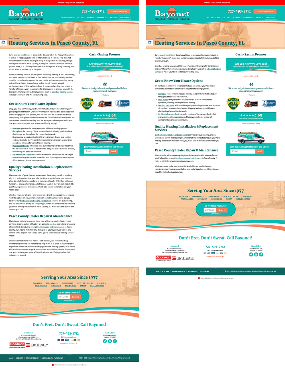
Before and after of shortened word-length experiment
AB test 2: “What CTA button converts better, 'Contact Us' or 'Get in Touch'?”
This was a common question between writers and designers. We cycled between 12 different options. It also seemed like a great one to test once we nailed our AB testing process down. We sought to follow takeaways from bigger brands and test button wording.
The statistical significance calculator told us we needed a pretty big boost in conversions to make this test useful.
Results:
- We didn’t get it. Our tool hit its timing limit of 3 months and found no leader. Although inconclusive as a whole, the opposite of our hypothesis was leading the way — “Contact Us” did better than “Get in Touch.” We learned we’d need to make changes with a bigger impact for this amount of traffic.
What I did
Project lead, data gathering
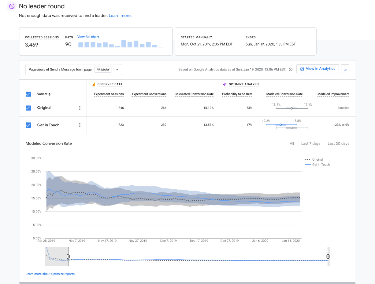
Our first AB test with no clear winner.
Best practices
These are often unspoken and soaked in with team culture. Shining a light on them makes conversations smoother and saves time once spent hashing out definitions.
Nothing's set in stone. Sometimes the practice breaks a convention enough to retire it. I consider this a type of data because it’s a step toward the objective.
Decided to stop using "flippers" on all sites
Upon research, we learned the method of button flippers we used didn’t follow industry or usability best practices. When hovered by a mouse, these multi-state elements turn over to display new info on their back. What was wrong with them?
- They hid conversion opportunities.
- They required a mouse on desktop, but on touchscreens they lacked an indication they were flippable. So it may have surprised folks and made them feel less in control. Surprising users is a big no-no.
- Clients liked seeing the flipping animation more than they considered the content. Some became a junk drawer of links, not considering the user.
What I did
Project lead, data gathering, documentation writer
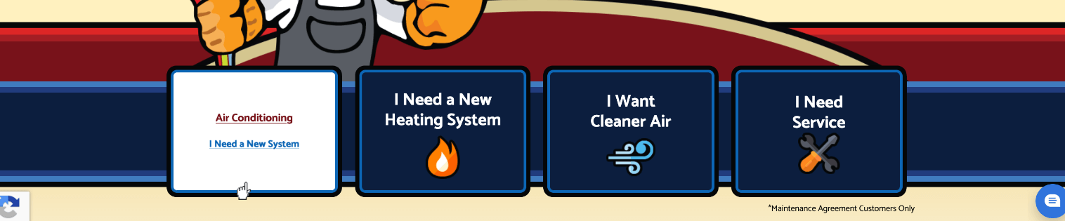
The flipper on the left is showing us its back
Moved the form field labels from within to above
Placing field titles within the field saves vertical space and reduces clutter, but we decided the cons outweigh the aesthetic.
- Cons: As the viewer begins to type their responses in the form field, the prompt disappears. When submitting the form, if there was an error, the title would no longer be present which may confuse someone. This may deter the user from submitting the form.
This may be common knowledge these days, but at the time, much deliberation was had for us to get there.
What I did
Project lead, data gathering, documentation writer
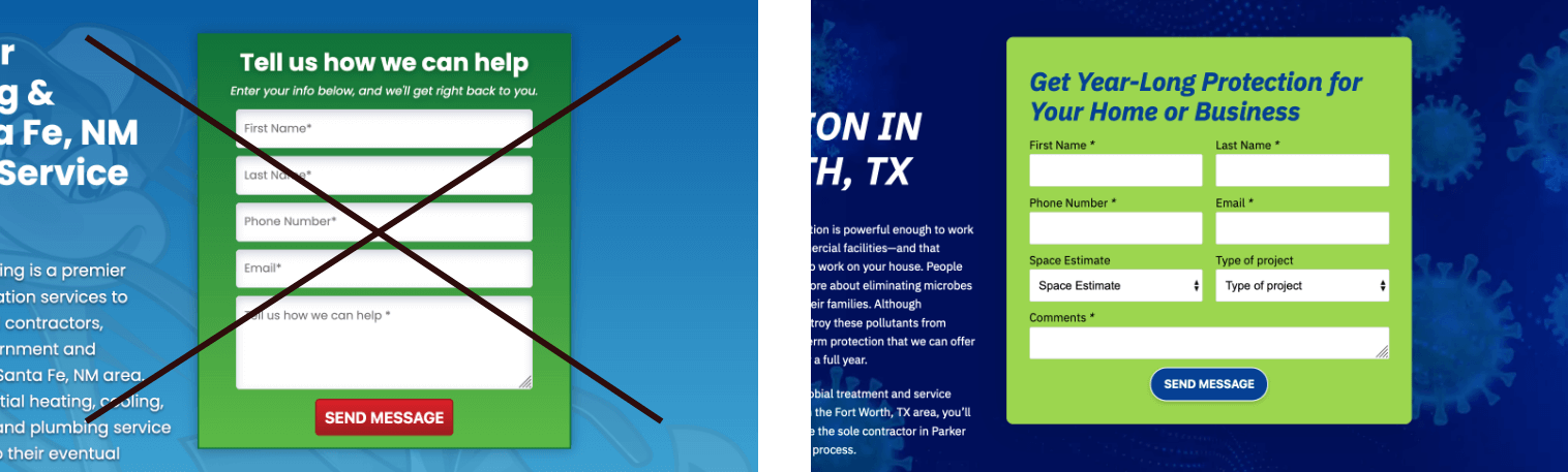
The form on the left has labels within the field. On the right, they're above the field.
Created governance for a growing agency
-
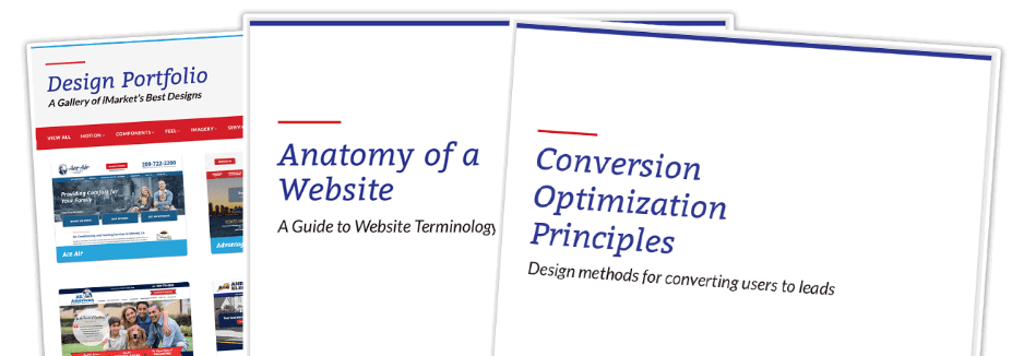
Conversion principles: Design methods for turning users into leads
This doc helped get the design team and others discussing design on the same page about our core design beliefs.
-
Anatomy of a Website: A Guide to Website Terminology
This doc was the precursor to a pattern library. We caught the startup disease of jargon-itis. This 23-page design glossary helped by naming and defining of every piece of our sites, including crowd favorites "banner", "hero", and "quicklink."
-
Design portfolio mini-site
We cranked out sites. This internal tool was a catalog for our proudest and highest performers. It was used by Sales and Project Management when showcasing our design work. It's job was also reinforcing the content from the two docs above: a common vocabulary and our conversion principles.
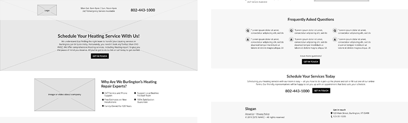
Personas
The goals of this project were two-fold: to make our landing pages less manual to build and to design them in a way that speaks more directly to users' problems. My fellow researchers and I tackled the latter.
Our clients get the bulk of their work through phone calls. As such, we had the ability to listen to their customer calls. With the raw call data, we synthesized trends into four personas, each with a unique user story.
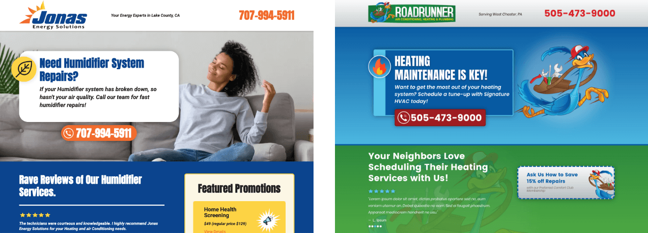
The personas were different enough to justify highlighting various content based on their respective situations, which led to the creation of a unique landing page design for each one.
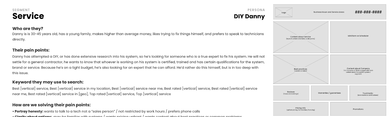
For instance, a person with a plumbing emergency requires assurance that the company can promptly resolve the problem, while someone contemplating a new heating system may want to learn more about the system and the installing company. Therefore, each persona's distinct needs called for separate landing page designs tailored to their specific situations.
Results
- Landing page creators now have four, instead of one, versions of layouts to choose from. Each corresponding with the top four customer needs.
- The new system populates dynamic content from styles specified by designers and can launch hundreds at a time.
Jump over to see some web design projects or my logo offering.